- hello@bertagency.co.uk
- 0161 452 0052
Publishing Technology came to Bert in search of a rebrand in the autumn of 2015.
A leading provider of content management, audience development and content delivery solutions, the ambition was to shake off the image of ‘publishing specialist’ and be a future-facing, content driven company. Publishing Technology’s software is being adapted for new markets, such as ‘media’, which will enable it to expand into new verticals beyond publishing and open up significant new potential revenue streams.
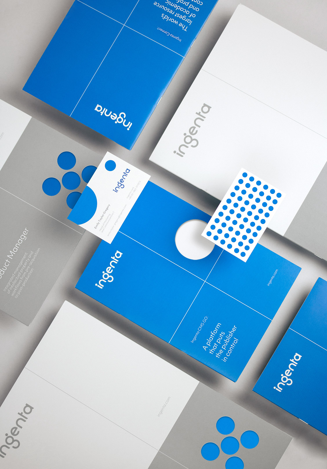
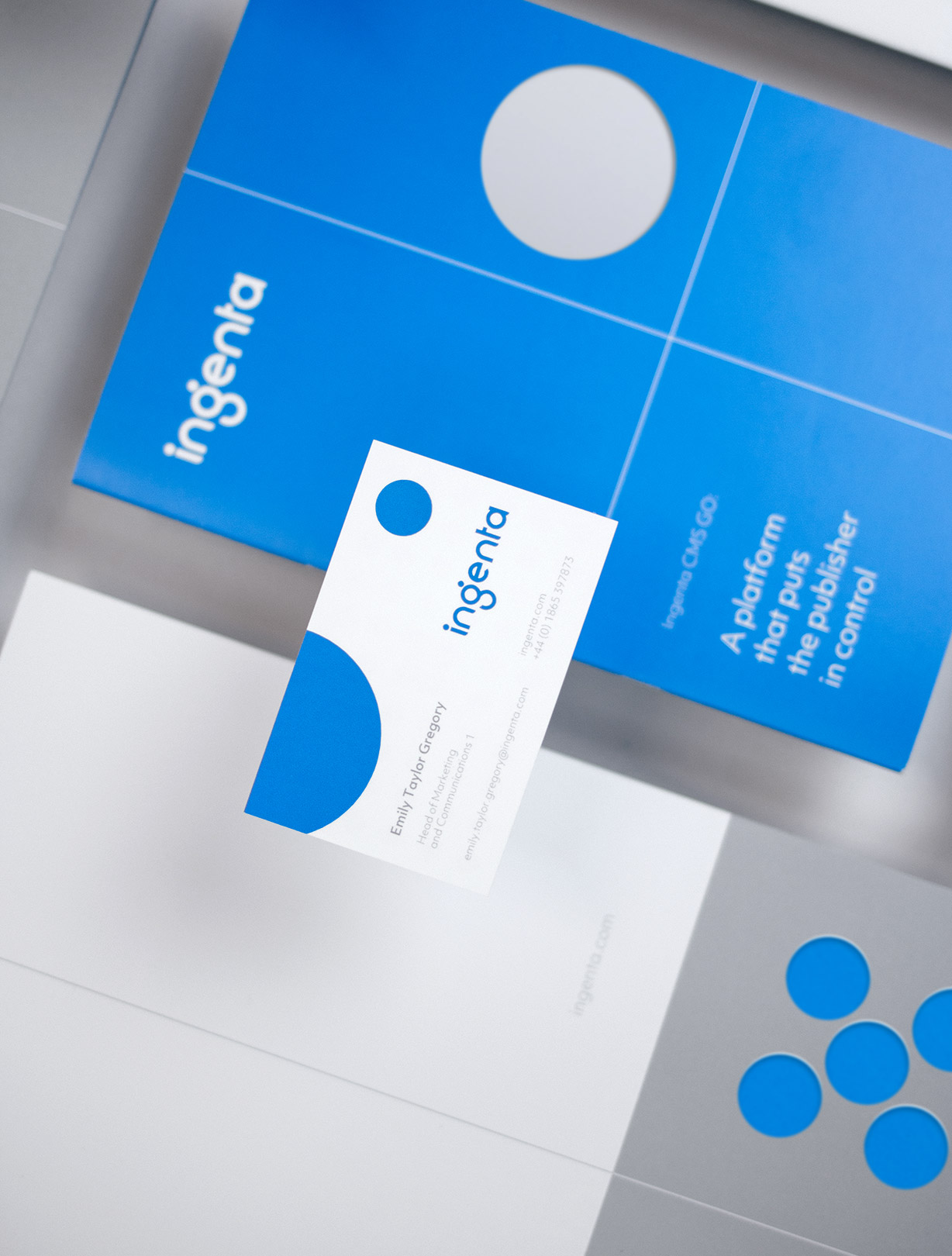
After a senior management decision to rebrand as Ingenta, Bert focused on a new visual identity.
After a senior management decision to rebrand as Ingenta, Bert focused on a new visual identity. We wanted Ingenta to look like a confident, focused, modern market leader. It didn’t want to feel like a Silicon Valley start-up as it has great history and heritage, but we wanted to inject an energy and modernity that the old identity lacked. We wanted it to look like a technology partner, but with a human touch; the expertise of each individual member of the company should shine through.
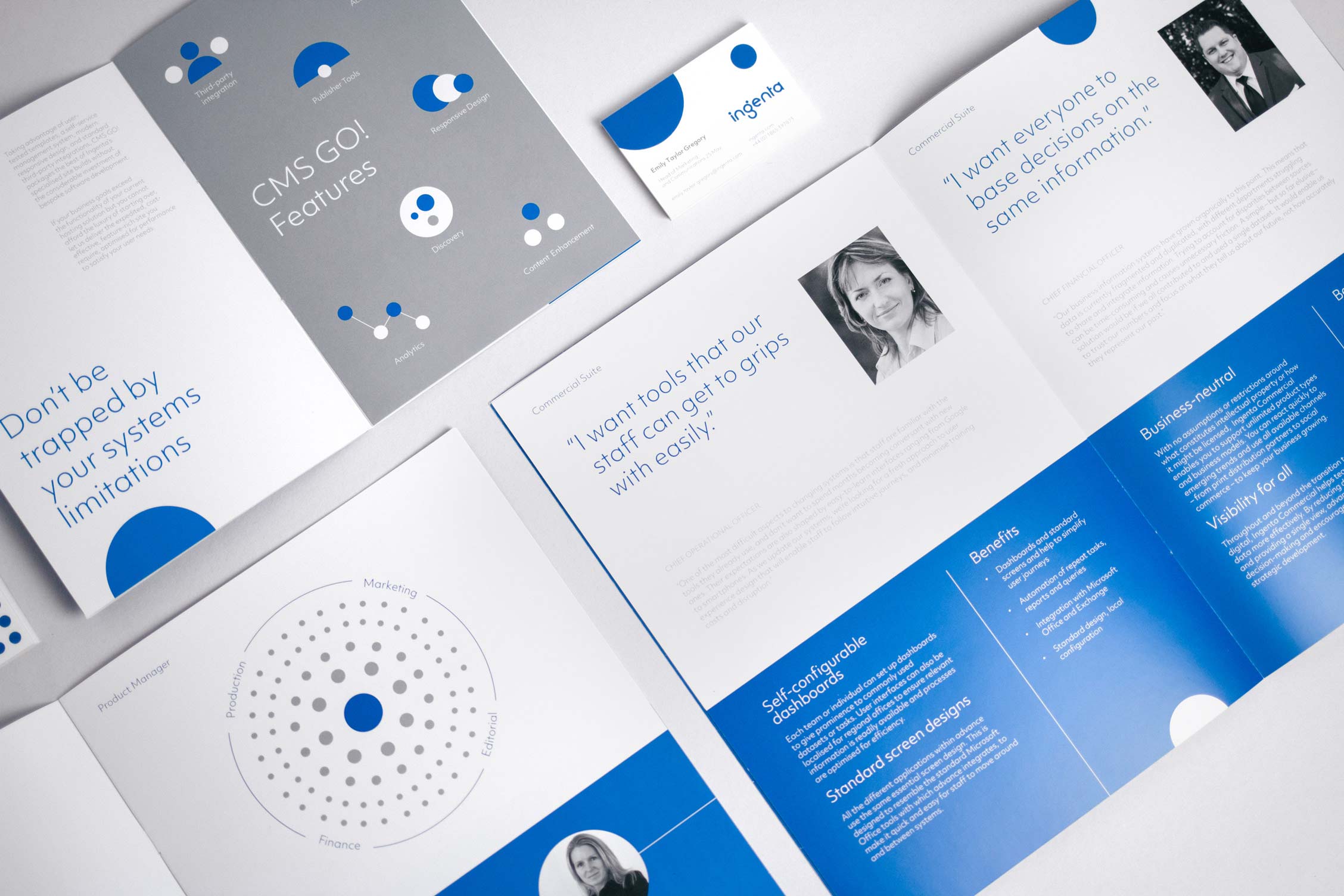
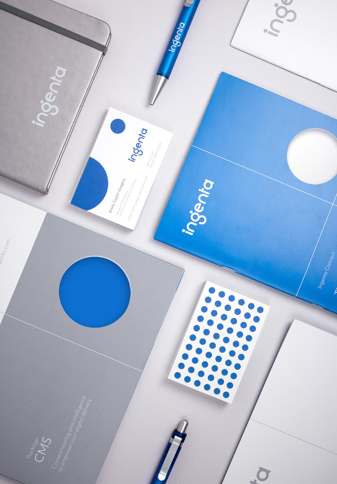
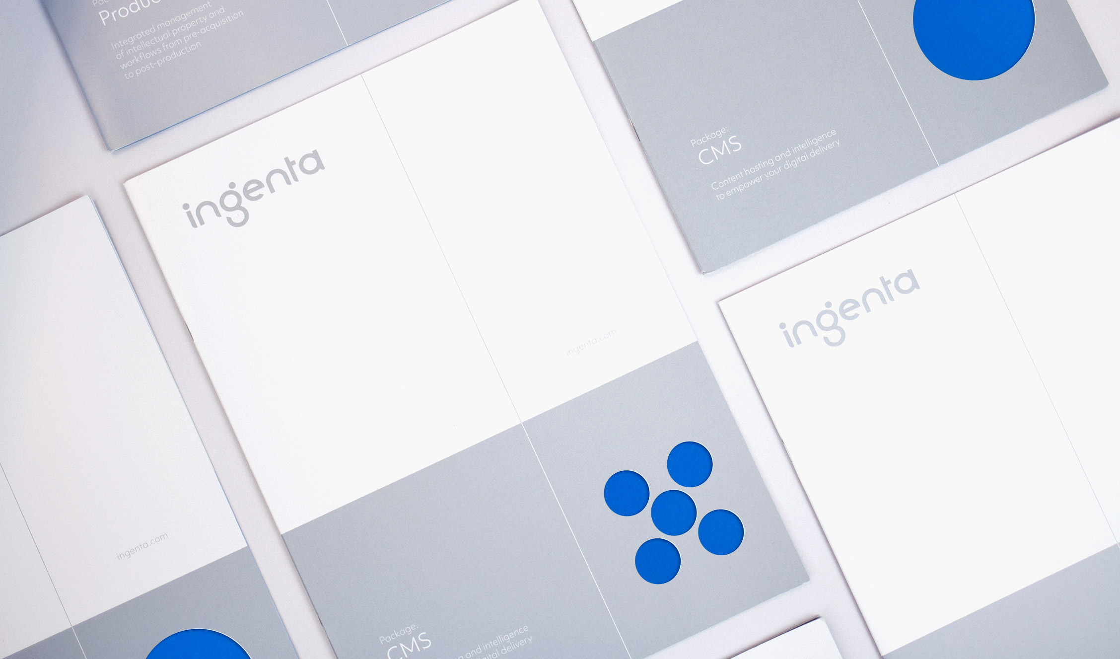
Taking inspiration from Ingenta’s industry ambition, we developed a modern logo mark with bold, dynamic elements including motion-based Ingenta dots representing the three vital elements of the Ingenta family: commercial, content and advertising. A confident, digital Ingenta® blue was chosen as the corporate colour.
Ingenta launched with great success at book fairs in the UK and Europe. The creative was then rolled out in brand films, adverts, the launch exhibition and collateral including interactive touchscreens and a full UK office rebrand. We also provided new branding for software products, created product training videos and materials for new clients and a comprehensive new collateral suite.