- hello@bertagency.co.uk
- 0161 452 0052
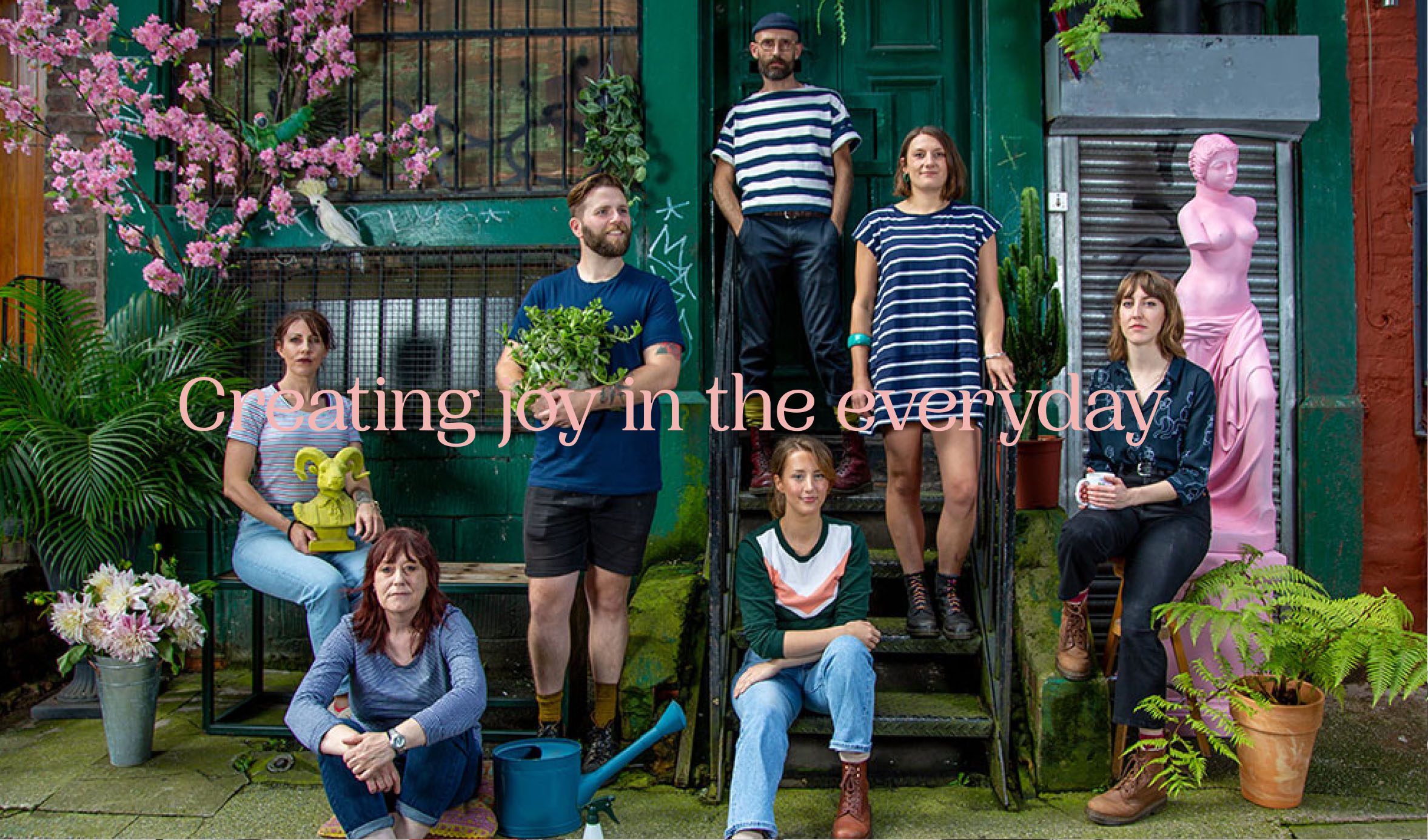
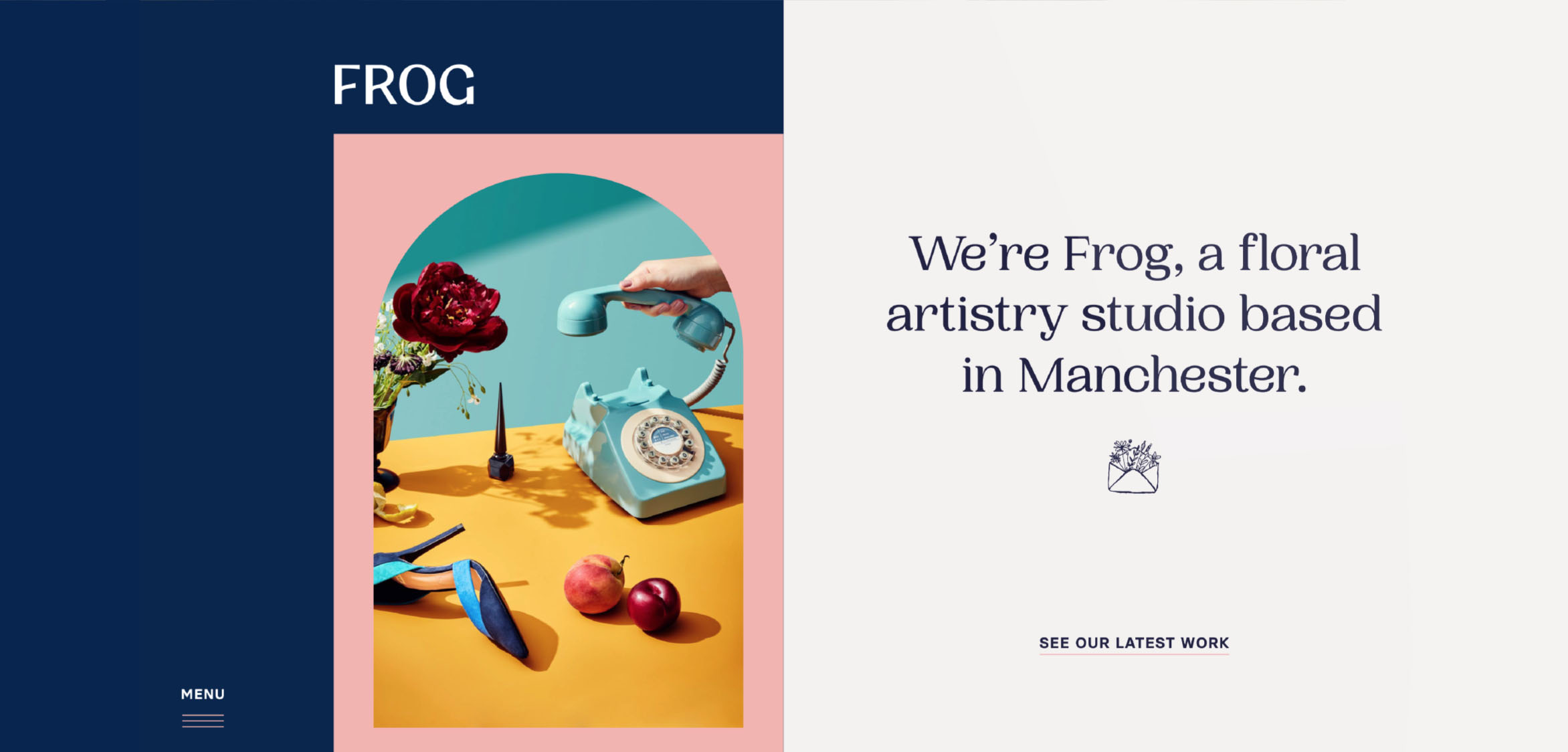
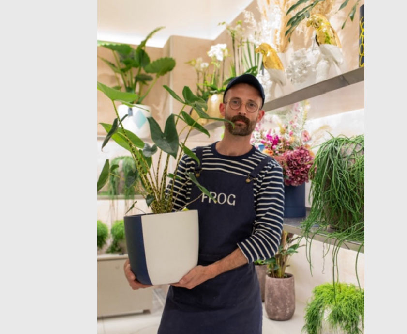
About FROG
Born in the French Alps, David Jayet-Laraffe moved to London in 1998 to pursue a career in horticulture. Working under Jane Packer he developed a national reputation and opened Frog, his floral artistry studio in Manchester’s Northern Quarter.
Disciplines
Visual Identity
Messaging + Strategy
Packaging
Print Communication
The process
Ahead of opening its first retail store, Frog contacted us to help reimagine its brand.
Our work began with immersion into Frog’s business and brand. The time spent with Frog’s team in the studio, warehouse and floristry school helped us understand the unique culture, processes and artistry that has become synonymous with the Frog brand.
We created a detailed co-creation programme that engaged the Frog team and key clientele in the creative process.
Outcome
By broadening our collective perspective, gathering global reference and research and pairing it with an internal exploration of everything Frog is and could become, we were able to help Frog distil its brand into three words; ‘uncontrived; joyful; unexpected.’
This first step created a platform upon which everything else was created, from brand strategy through to the visual identity.
We created a brand that harmonises and enhances everything Frog is and does.
Visual identity
Only a small proportion of Frog's customers experience the studio or flower school. We therefore wanted to ensure the visual identity encapsulated the entire brand experience.
The new visual identity system allows Frog to extend its bold personality to a wider audience.
Design signifiers
Every aspect of the brand identity has been designed to embody the founder's unique blend of high-artistry and love for the unexpected / whimsical.
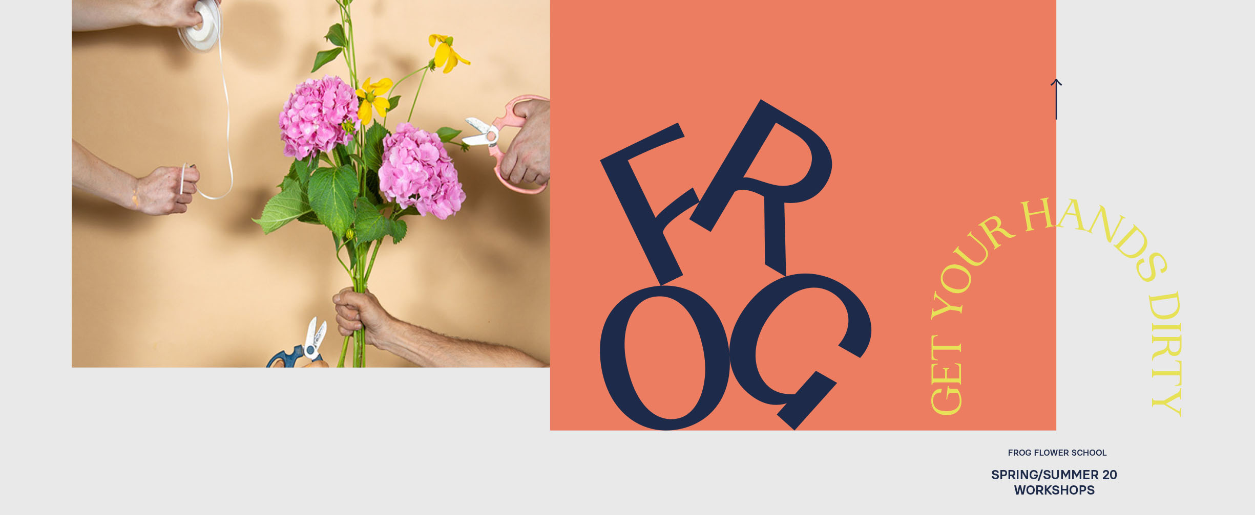
The hand-crafted logo mixes curved cross-bars with sharp apexes, creating an utterly unique mark that delivers unorthodox balance. This is paired with a bold use of colour, distinguishing the brand from the minimalist, monochrome aesthetic synonymous with the industry. Interchangeable typography, brand signifiers, playful art direction and animation support the core elements to create a complete visual identity system.
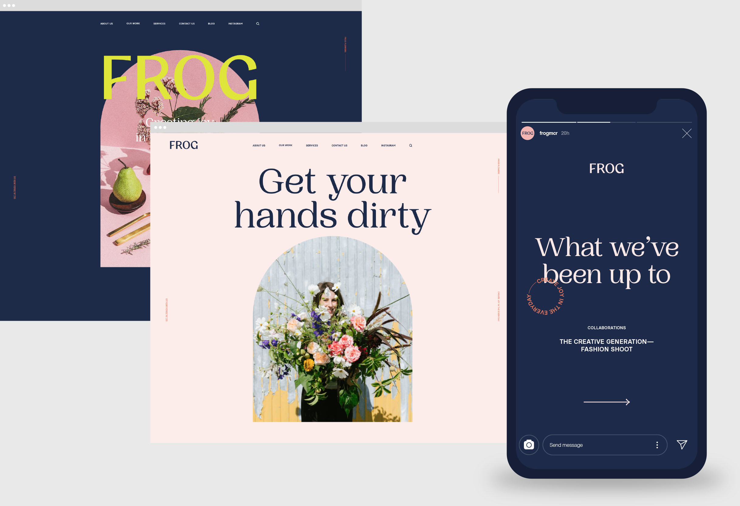
Digital experience
Following research into the digital behaviours and expectations of audiences, the new Frog website has been designed to be ‘mobile first’. Communicating the breadth of Frog’s offer on mobile was the central to the challenge; from brand collaborations and giant installations, through to the Flower School and weddings. Equally the upcoming retail store and bookings platform had to be delivered beautifully on the smallest of screens.
Social templates and design kits were also delivered for use by the in-house team. The solution allows Frog complete control over its online experience, whilst also delivering a strong representation of the brand online.
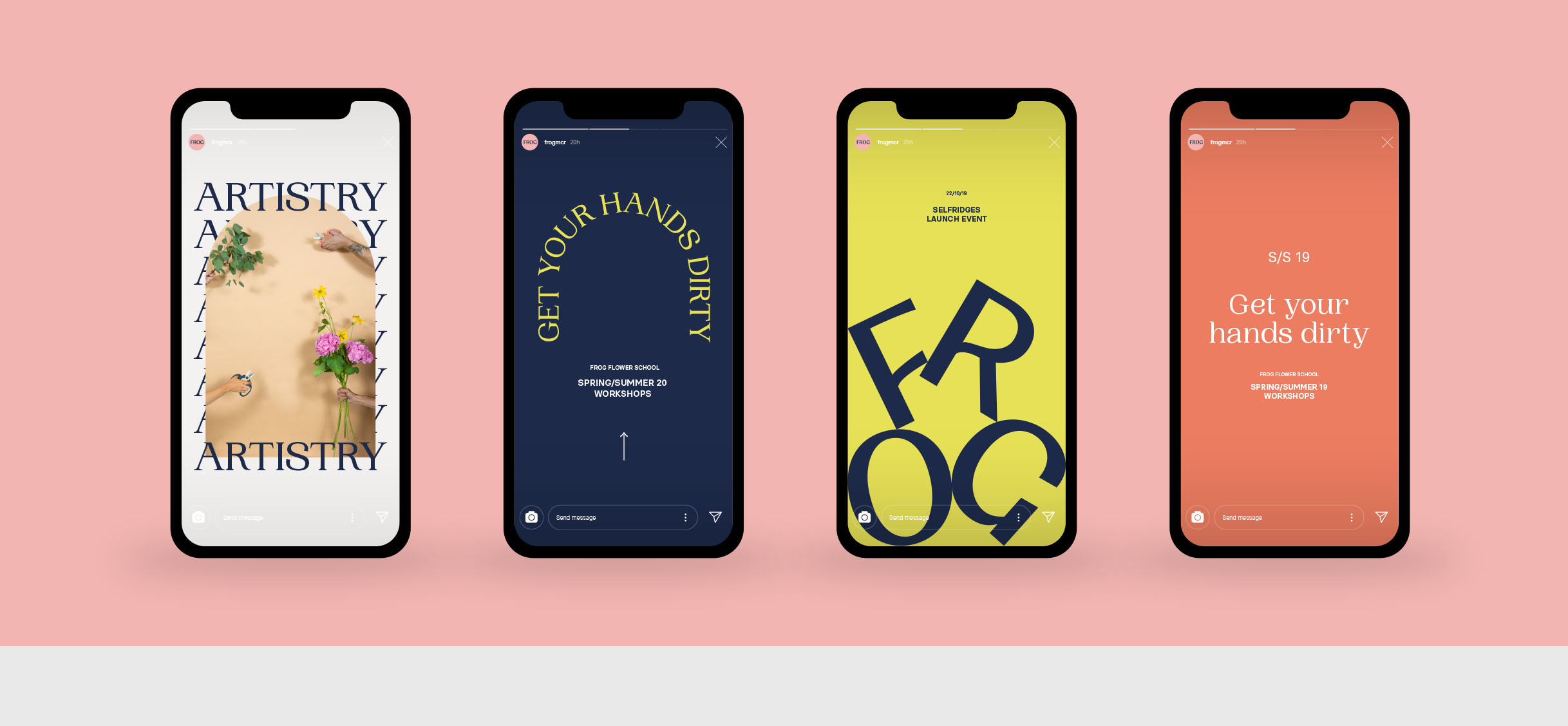
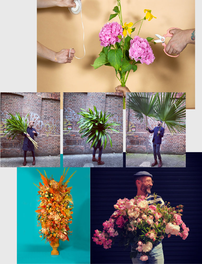
Art direction
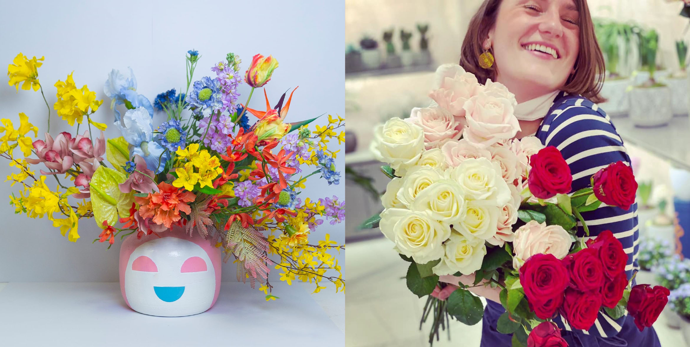
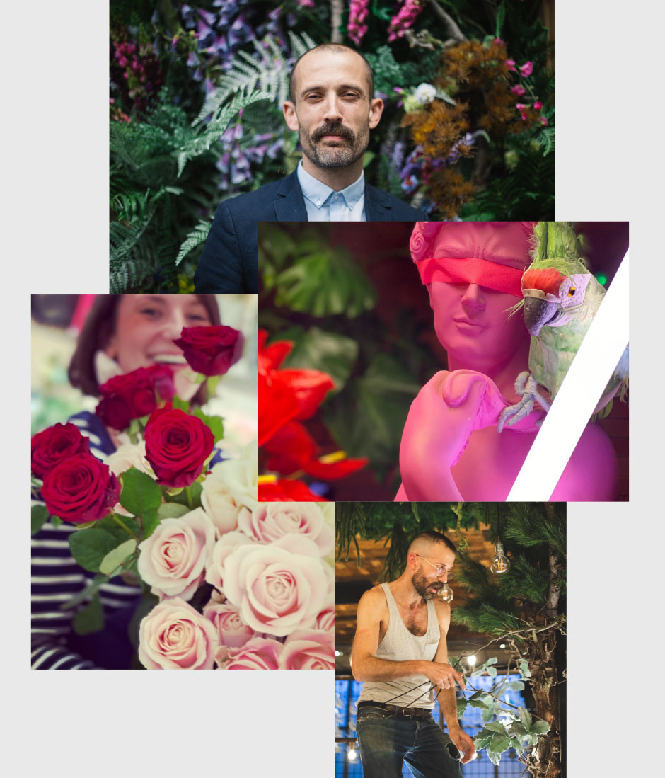
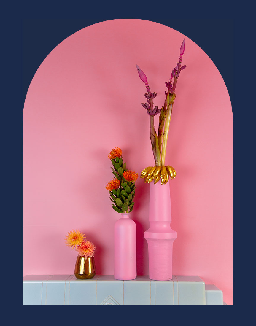
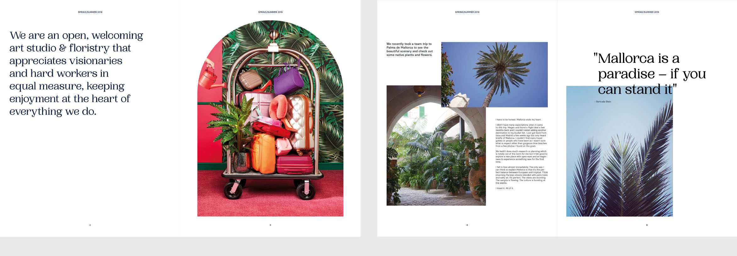
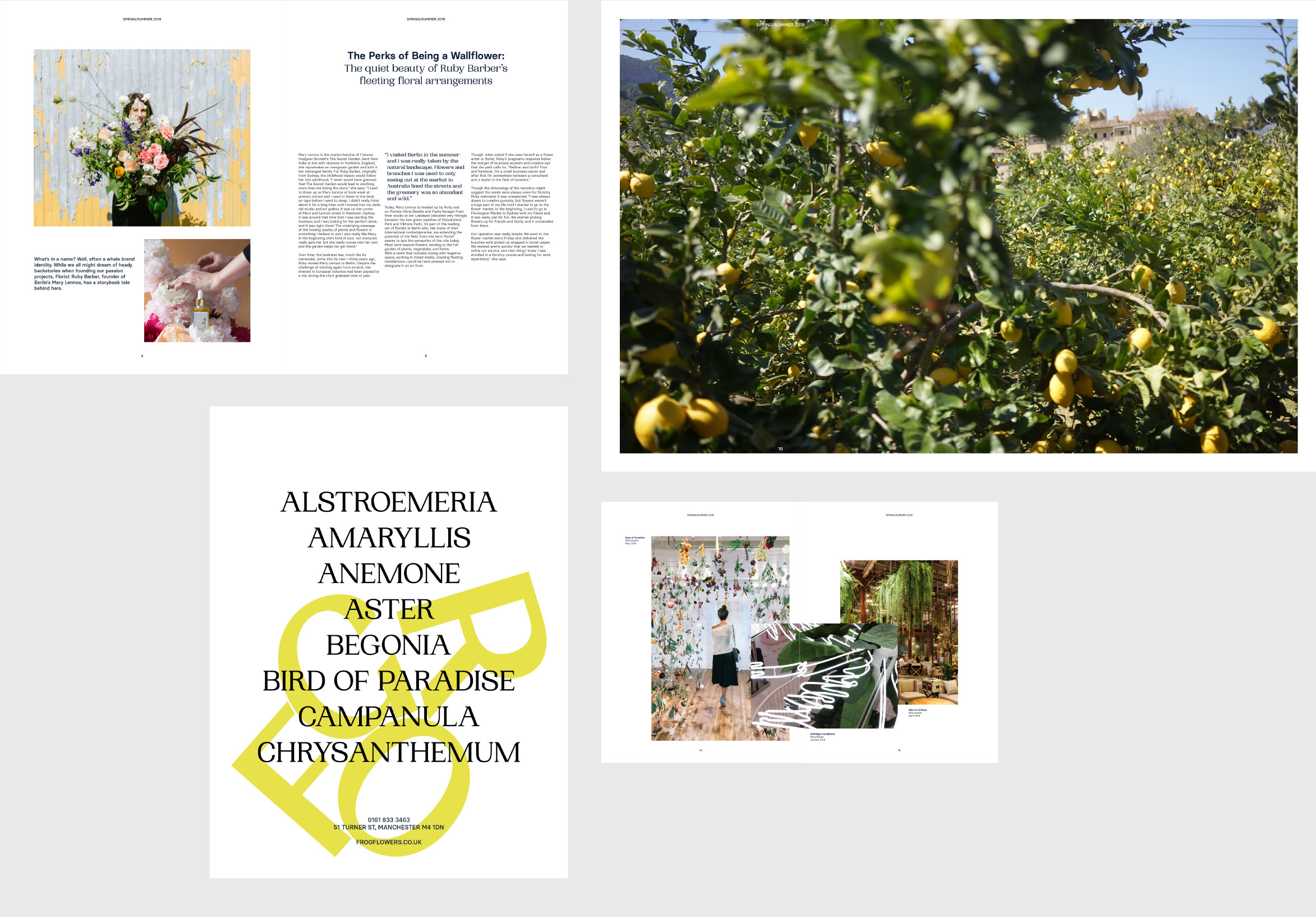
Our art-direction conveys Frog’s love for creating unexpected moments of joy through inventive and elegant design, language and photography.
From created still-life to art-inspired fashion shoots, Frog imagery entertains and aims to convey an existence that scores high on both aesthetic and enjoyment.
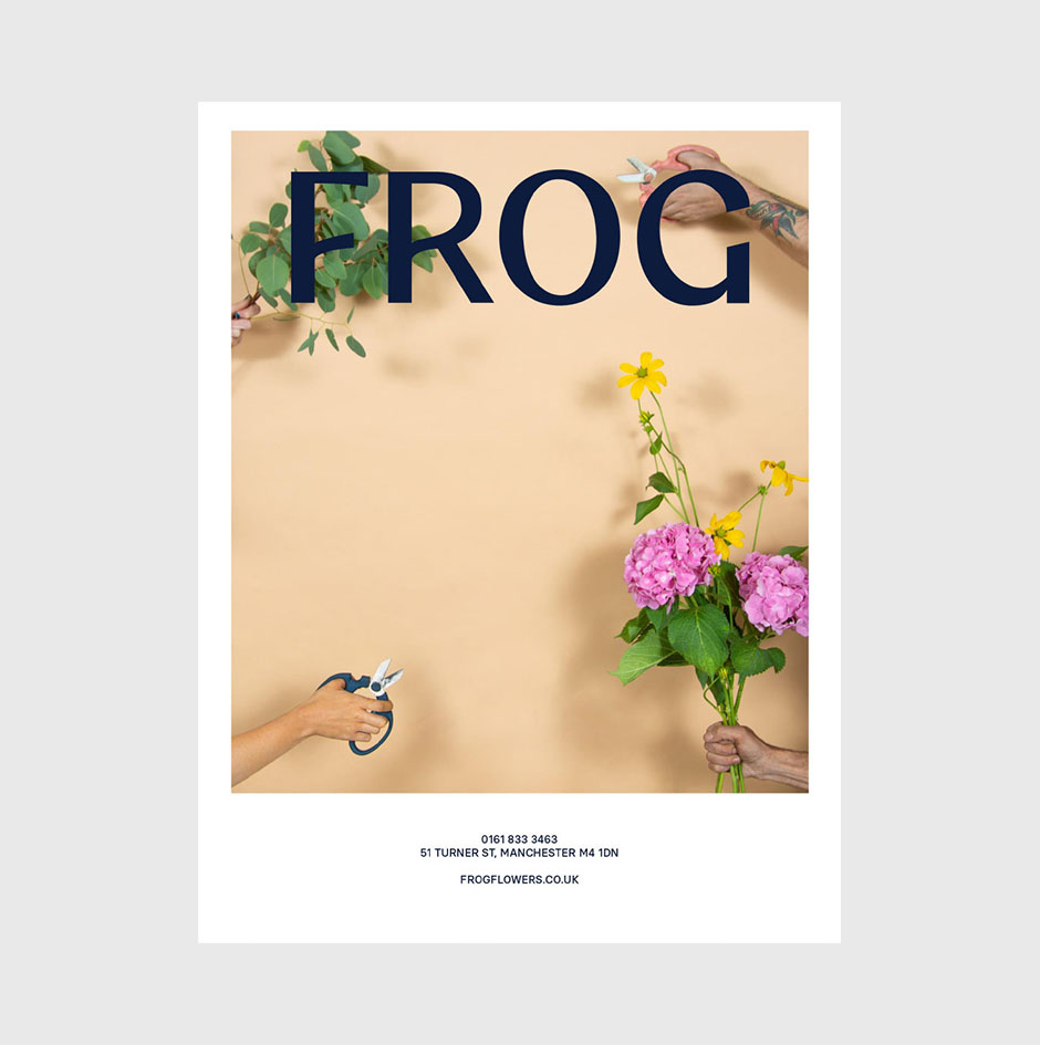
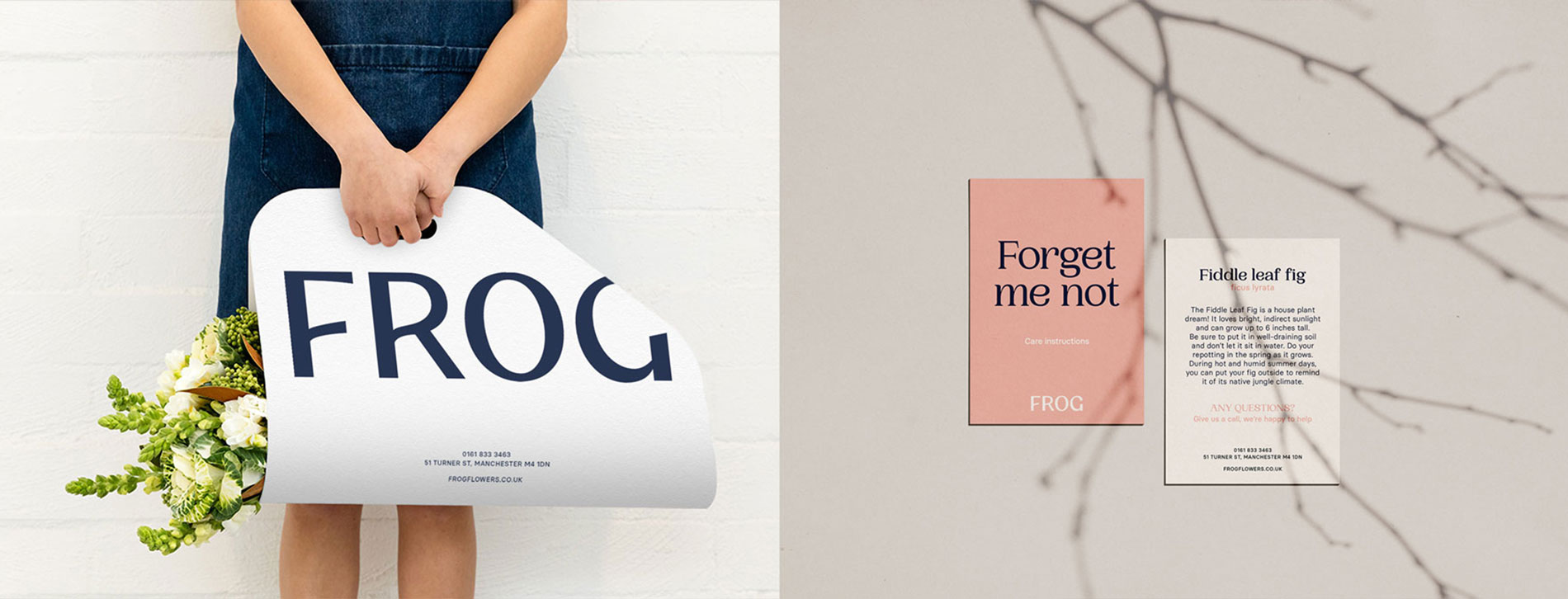
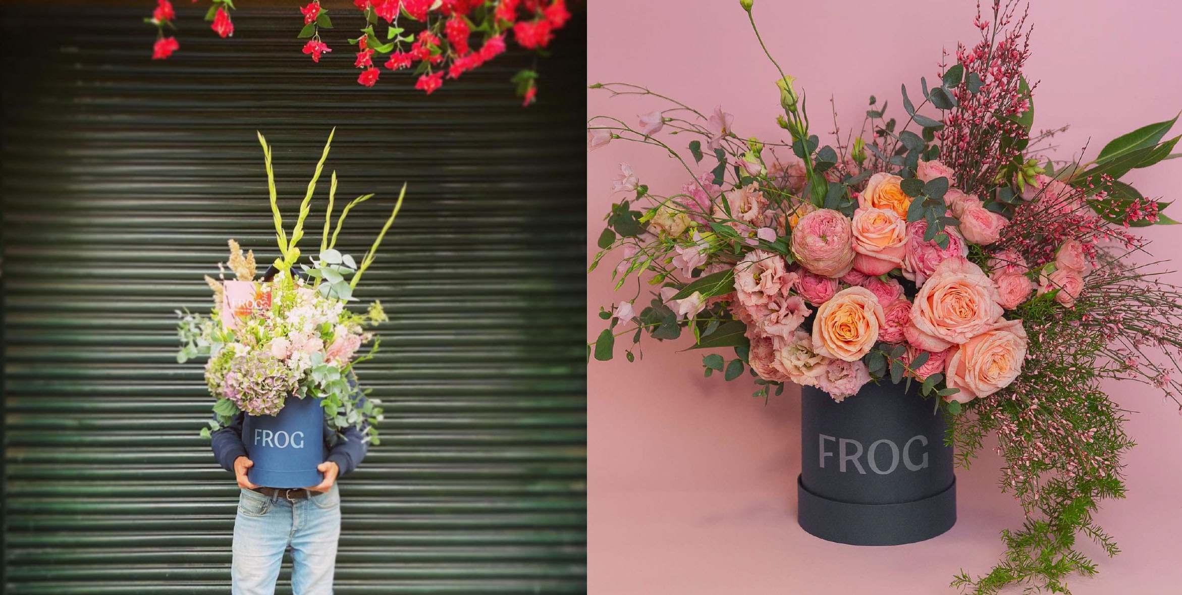
Print and Packaging
To complete the brand experience, stunning packaging was created ahead of Frog’s Selfridges UK retail launch, from grab-and-go bouquet wraps, care labels and guides through to high-value cylindrical gift packaging.
Environment
As with all identity systems, the brand experience is best enjoyed whole - either in-store, in studio or at the Floral School.
Packaging is used to create a retail environment in Selfridges stores that delivers brand experience first with the expected aspects of a visual identity system, logo, colour, narrative, messaging playing a secondary role.
In-store and studio, neon hits uncomplicated beech plywood and spectacular natural floral artistry buts up against metals powder-coated with fluorescents to create a joyful, uncontrived and unexpected experience.